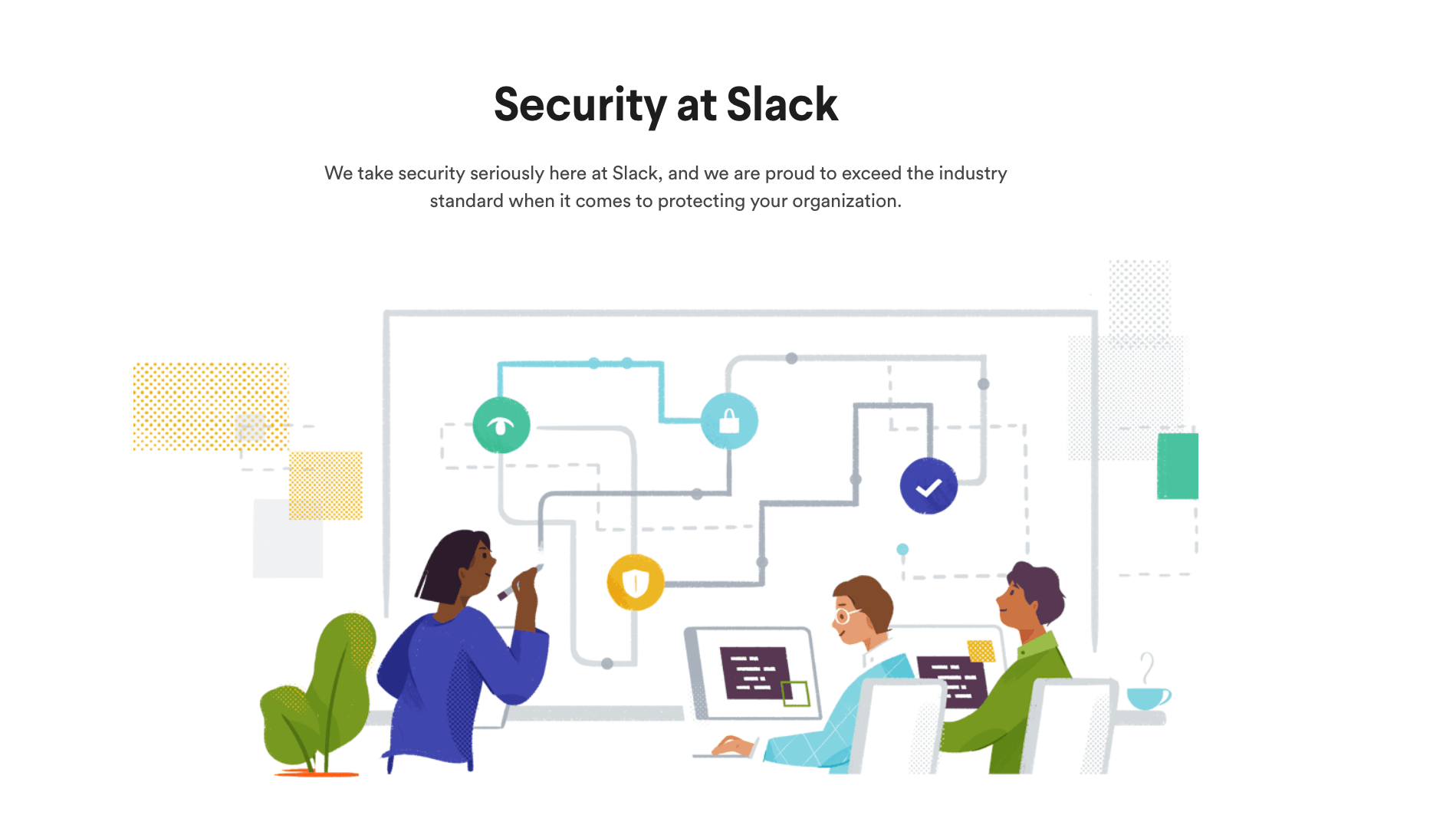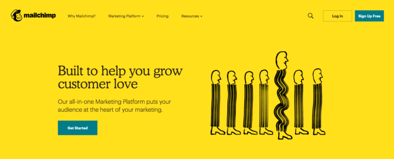
I’m sure you’ve noticed this ubiquitous illustration style by now. Depending on who you ask, these cartoons are either fun and whimsical, or strange and faceless. Maybe you see them as friendly-looking doodles … or maybe you see them as just plain weird.
Whatever your opinion, one thing is for sure: these little buddies are everywhere right now. For better or worse, they have completely taken over the visual identities of many high-profile SaaS brands.
Now, many marketers are wondering—how did this happen? Why are there so many similar-looking illustrations on so many different websites? How did all of these brands decide to use this style at the exact same time? And doesn’t this go against the very idea of positioning your brand as something different?
For example, Jimmy Daly, Marketing Director at Animalz, recently called out this design trend on Twitter. And while he says he doesn’t dislike the style, he also isn’t sure how it got to be everywhere at once.
i genuinely respect all of these companies and use these tools but saas websites are perpetually homogenous. what gives?
— Jimmy Daly (@jimmy_daly) June 4, 2019
Here at Unbounce, we recently went through a rebrand of our own. And while we considered illustrations, our design team ultimately decided to go in a different direction. Instead of flat, geometric shapes, we chose to use custom photography to help us put our customers in the spotlight. (Although we’re not alone—custom photography seems to be another growing design trend for SaaS brands.)
But going through the long, long, very long process of a rebrand got us thinking. As marketers trying to stand out in an increasingly competitive industry—is it bad for us to follow design trends? What inherent value is wrapped up in visual branding? Is it worth a heavy investment in design to look different? And how vastly different can we all truly be?
Let’s dust off our old-timey magnifying glass and investigate…

Why Marketers Are Obsessed with Visual Branding
In our heart of hearts, I think every marketer is a “creative” type. We were the kids in school doodling on our notebooks, coming up with ideas for the next great Goosebumps novel, or filming half-baked comedy skits using our one friend’s video camera. (Thanks, Brad!)
So really, it makes sense that we care so friggin’ much about the way our brands look. The logos, fonts, photos, illustrations, and other visuals we use are all opportunities for us to show off just how creative and different we can be. We want you to be impressed when you look at our website—or any other part of our brand’s visual identity, for that matter. It’s in our DNA.
According to Sabrina Chan, Interactive Designer at Unbounce (and huge contributor to how the Unbounce brand looks today), this is part of the reason why companies seem to rebrand so often.

Coming up with a new visual brand is absolutely exciting, whether you do it by yourself or with the help of an agency. It’s a great creative challenge because—unlike most other marketing projects—you aren’t forced to play within a sandbox, or follow a specific set of rules. When you create a new visual brand … you actually get to shape the sandbox itself.
Marketers also obsess over visual branding because we’re under constant pressure to keep up with the times. (And the web changes fast, yo.) One second we’re all using gradients on our buttons and adding drop shadows to our form boxes, and the next we’re making every page element as flat as a Kansas-style pancake. If you’re still using styles that have fallen out of public favor a few years after the fact, it can raise a few eyebrows.
Sabrina says the goal is for your brand to either fit in or stand out—but never fall behind.

Nobody wants their brand to look like it hasn’t been updated in years. You only get one chance to make a first impression … and most marketers and designers will do anything to make a good first impression. Especially if your competitors are all out there looking fresh and up-to-date.
At the same time, this obsession with visual branding can come with a heavy price tag. Whether you hire an agency to rebrand for you or work with a team internally like we did at Unbounce—the process can take many, many months. It’s never as simple as making “just a few quick updates to the company logo.” You almost always need to scope out a big chunk of your marketing team’s time, budget, and brainpower.
According to Andy Crestodina over at Orbit Media, a “fancy site from a big web development firm” can easily run you up a bill of more than $100,000.

Here at Unbounce, we spent over half a year doing research, running impression tests, creating mockups, and iterating on our new brand before we launched. And while we have gotten (mostly) great feedback on the finished results—it can still be really tricky to connect the design’s impact of a new visual brand to actual ROI.
Sure, there are lots of ways to calculate how well your website is converting. But can you attribute that to the branding itself? It’s not so simple to draw a straight line between your looks and your bottom line.
But Your Brand Does Matter—Maybe Now More Than Ever
Even if you can’t easily attribute direct revenue to your visual branding, at least you can take comfort in the fact that almost every marketer agrees it’s still pretty dang important. Potential customers take one look at your brand and form an instant impression—long before they explore your products or check out your pricing.
Here’s what Vicky Bullen and James Ramsden of the design agency Coley Porter Bell said about the benefits of visual branding earlier this year.

Over the last few years we’ve seen many brands and their identities evolve into a state of homogenization … [But] many categories are having their traditional ‘design codes’ turned on their head as new or artisanal, challenger brands come along and create a completely new way to interpret a tired category.
They were speaking specifically about food brands, but the same line of thinking can apply to many software companies as well.
Because in the world of SaaS, branding is particularly valuable. The space is so saturated with competition (there are over 7,040 marketing technology companies alone), that most companies are eager to stand out from the competition. A unique and authentic brand is a great way to elevate your software over everybody else.
On the The Re:Growth Podcast, Dave Gearhardt, VP of Marketing at Drift, even went so far as to say that branding was a key differentiator that helped their team to succeed.

We knew in order to win, we needed to do things the opposite of how everybody else was doing it. We needed a different way to stand out. And for us, that was brand.
Chris Savage, CEO of Wistia, has also been exploring the importance of branding in a new original series called Brandwagon. According to Chris, branding is more important today because traditional marketing tactics are breaking down.

A more fragmented and less measurable customer journey means that if customers aren’t positively disposed to you before they begin their product search, you’ll never make it to the consideration set. Consumers now have access to all the information they could want on your product/service at their fingertips, including how it stacks up against competing offerings … [so] we need to move beyond solution-based value propositions.
But design trends in branding aren’t anything new, either. As part of our research for this piece, we dug into some of the many different styles that have flared up over the years.

Timeline Sources:
Business Insider, AIGA Design Conference, Codeburst, Web Design Museum, Instani, Line25.
Image Sources:
- Bass Brewery’s original logo. Digital image. Zythophile.com. 28 June 2013, http://zythophile.co.uk.
- A vintage ad for Coca Cola from around the late 19th or early 20th century. Digital image. Smithsonian.com. 29 March 2017, https://www.smithsonianmag.com.
- Michelin Man educational advertising, circa 1907. Digital image.
- LogoDesignLove.com. 21 December 2012, https://www.logodesignlove.com.
- Betty Crocker, 1955. Digital image. PBS.org. 15 February 2013, http://www.pbs.org.
- Apple.com screenshot from 1996. Digital image. The Telegraph. 2 September 2009, https://www.telegraph.co.uk.
- Website design from the early 2000s. Digital image. UX-App.com. 23 July 2018, https://www.ux-app.com.
- Airtable custom SaaS illustration. Digital image. InternetFolks.com. 22 October 2018, https://internetfolks.com.
So Where Did This Cartoon Design Trend Come From?
Travel in time with me all the way back to January 2017. Barack Obama was serving his last few weeks as President of the United States. Serena Williams was busy winning the Australian Open (while pregnant, no less). And a movie about sentient vehicles called Monster Trucks somehow made $33 million at the box office.
It was around this time that Alice Lee, an independent illustrator and designer, started working with Slack to help them create a new illustration voice and library. She partnered with their team to create over 40 separate illustrations that they could use in a variety of different places on their website and platform.

Many designers point to these 40 original illustrations as the possible beginning of this current visual branding trend. And in a blog post on her website, Alice details where her original inspiration for these designs came from.

I wanted to look outside the tech industry for inspiration … I referenced much of Mary Blair’s legendary body of visual development at Disney for designing warm, whimsical characters. And it was hard not to fall in love with the ‘minimal realist’ compositional balance that Charley Harper strikes.
Another possible origin of this trend is Facebook. In 2017, the social media platform was also going through a rebrand of their own. Their team worked with a design firm named Buck to come up with a new style. And in a recent post on the AIGA Eye on Design blog, illustrator Xoana Herrera described her inspiration for the project.

I started to draw characters that were defined by their actions … Dancing with their open arms, bending their bodies to play the trumpet, for example … I wanted to portray that sense of joy we feel when we’re sharing things together in community, like celebrating a goal in a bar or singing a song with a crowd at a concert.

We saw this trend continue to evolve over the following year. When Mailchimp pulled off their rebrand in September 2018, it created shockwaves that influenced the entire marketing community. The typeface! That yellow! The illustrations! It was like a breath of fresh air for an industry that was drowning in a sea of stock photos.

Here’s what Gene Lee, VP of Design at Mailchimp, said they hoped to inspire with their new brand.

With this redesign, we set out to retain all the weird, lovable elements that endeared our earliest customers to Mailchimp…We champion authenticity, originality, and expressiveness because it’s what helps us—and our customers—stand out. We hope to inspire them to be more bold and creative in their own branding efforts.
This is when the butterfly effect really started to take shape. Since September 2018, hundreds of SaaS websites have rebranded using a similar—albeit, less abstract—illustrative style.
Now, there are thousands of these flat illustrations turning up on stock photo websites, entire Twitter accounts dedicated to calling out this trend, and even mix-and-match design libraries that make it easy to create your own unique cartoon scenes.

Why These Cartoon Humans Started #Trending
At this point, you’re probably wondering why so many companies decided to go with this Nickelodeon-esque style. And actually, there are a number of very practical reasons why these illustrations became popular…
- They’re representative – With illustrations, the humans you show can come in all shapes, colors, and sizes. This can be an important distinction for socially conscious brands who want to make sure they’re being inclusive for all types of people and communities.
- They’re flexible – A lot of SaaS companies struggle to show off their software using stock photos. (Let’s say you’re selling accounting software, for example. I hope you like messy desks with calculators.) Illustrations can help you represent complex or abstract ideas in a much more clean and simple way.
- They’re scalable – You don’t have to have a pricey photoshoot for every new hero image. With illustrations, you can just iterate on a style or framework that you’ve already created. What’s more—you can use them to execute fast, which is a huge win for startups in growth mode who don’t have a ton of money to invest in branding.
- They’re unique – I know a lot of the illustrations we’re featuring in this blog post look similar, but you can still see some wildly different approaches out there. For example, check out the style of a company like Officevibe and compare it to what Intercom is doing. Nobody is going to confuse those two companies based on their visual brands.
- They’re full of personality – For SaaS companies in particular, this trend is appealing because of how much personality each image can contain. The illustrative approach harkens back to children’s storybooks, making the software seem more friendly and approachable. (Take a look at the Mailchimp website, for example, and tell me it doesn’t remind you of Curious George.)
At the Same Time, There Can Be Trouble with Being Trendy
When it comes to design trends, there are always potential dangers if you jump in without doing your research first. It’s almost never a good idea to change your entire brand overnight just because “everyone else is doing it.”
This is why Alice Lee, one of the originators of this trend, warns other companies to think things through before adopting a similar illustrative style.

I am often approached by companies who simply want me to reproduce work I’ve already created for past clients’ specific brands … But I do believe that to create an illustration identity that’s distinctive, new, and powerful, it’s important to take an intentional, process-driven approach.
There are other potential challenges with this trend as well…
- These illustrations might not match your brand personality – Well, unless your brand personality is ‘Playful’ with a capital ‘P’. If that ain’t you, then these quirky cartoons might come across as inauthentic or off-brand to your target audience.
- They might not be as scalable as you think – While they might be less expensive than custom photo shoots, unique illustrations also don’t come cheap. If you want non-generic doodles for your brand, you’re going to have to pay an artist to create them and have a plan in place for when you need more.
- This style isn’t as unique anymore – If you jumped on this trend a year or two ago, you might have been ahead of the curve. Now, you run the risk of just looking like everybody else.
And while illustration can help make your brand appear more friendly, real photos of real people can be powerful in their own way. Alex Kracov, Head of Marketing at Lattice, explained in a Tweet why they moved away from illustrations.
Tried to buck this trend w/ the redesign that we launched today at https://t.co/gPtdvXY4wV
We used to have the same illustration style, but as a People product, we felt the need to switch to photos of real humans. The CGI backdrop helps maintain the playful, approachable vibe. pic.twitter.com/F1tLaD7pCE
— Alex Kracov (@kracov) June 7, 2019
The bottom line is this: as marketers, it’s our responsibility to do our due diligence and discover what resonates best for our particular brand, industry, and customers. This is something Dan Cederholm, Co-Founder of Dribbble, talks about in a recent blog post.

My advice was to not worry about trends, but rather use the style best applied for the task at hand and stick to it. Go with what feels right for the problem you’re solving.

Design Trends Are a Flat Circle
This illustrative trend caught on fire so fast that many marketers were caught off guard. But this is the type of thing that happens all the time in the fashion industry. Bell-bottom jeans, choker necklaces, lumberjack plaid—they all became massively popular, died down, and then came back around to being “cool” again. It’s the circle of life, folks. (Cue The Lion King soundtrack.)
Matthew Strom, Senior Product Design Lead at Bitly, noticed that more and more websites were starting to trend in a similar way, and he linked this idea to the economic principle of minimum differentiation. In short, most marketers and designers are going to put in the minimum effort and risk in order to succeed—and that means we’re going to end up making a lot of the same choices.
Here’s how Matthew describes the inevitable “same-ification” of the internet.

The convergence of competition to nearly-identical products is not just a coincidence: it is inevitable. It seems irrational, but the math is sound. This is an emergent phenomenon … even if they try to differentiate themselves, all websites will eventually flock together.
So hey, maybe there’s nothing inherently wrong with following a design trend if we’re all gonna end up looking the same anyway. Marketers use up a lot of collective brainpower trying to create unique visual identities that set them apart—but perhaps we’re all just fighting a losing battle.
Because in the end, there’s no real evidence that any design trend—whether it’s illustrations, custom photography, or even 3D images—is good or bad for your brand.
You just need to make sure that whatever decision you make, you make it deliberately.
read more at August 29, 2019 at 08:01AM by Luke Bailey Digital marketing


